The Rise of The Purple Reign
By Stephen Bevis
To a backdrop of proud tradition and thwarted ambitions, the Fremantle Dockers challenged entrenched fan loyalty by refining a new identity in a hard-nosed pursuit of success.

IT WAS THE campaign that unleashed the full force of the Purple Army.
A campaign that drew a new wave of recruits into the ranks of the perennial underdogs’ motley multitudes by distilling their foundational red, green and purple into the intense power of one—one colour to rule them all.
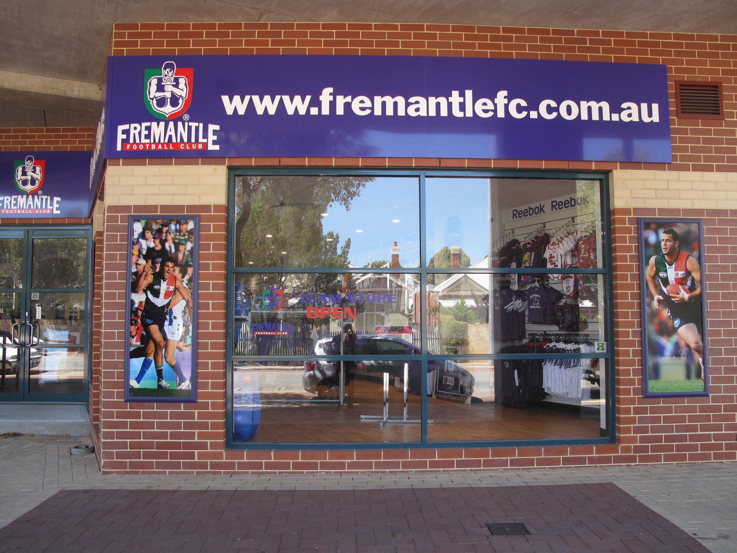
In the first decade after their AFL inception in 1995, Fremantle Dockers Football Club and its fans rode a frustrating rollercoaster with many more bellyaches of despair than delight. They had yet to earn the respect of the competition—especially not from their smug West Coast cross-town rivals. Despite moments of greatness, they appeared weighed down as much by their increasingly cluttered, inconsistent brand identity as by their on-field mediocrity and second-fiddle status in WA.
“Some likened the rebrand to an ambush when it was unveiled in October 2010 after a tightly held design development process by Block’s creative team under the secretive project name ‘Bob’.”
As Martin McKenzie-Murray reflected in The Saturday Paper in 2022, “depending upon your allegiance, the team’s symbol—an anchor—was either a great joke or a bleak omen.”
Yet by 2008, Freo seemed to be on the cusp of some serious on-field success. An exciting new crop of players was developing under hardline coaches Mark Harvey and later, his successor Ross Lyon.
The Club’s Board and Executive looked to apply a similar firm reset of the pillars for sustained success with a back-to-basics rebrand by Block to help build the supporter and sponsorship base.
In 2009, the Club surveyed more than 2,900 club members and listened to sponsors, supporters and non-committed members of the public to find out what they thought Freo and its brand stood for. The results pointed to a purple renaissance to reflect the confidence, authority and stature of a mature and successful footy club. A more timeless look, rather than one yoked to the character-based sports franchise styles of the 1990s.
Key feedback themes were “simplicity, authenticity and strength.” Purple was seen as being “strong, liked and unique” in the AFL whereas the use of red and green was described as “fractured and distracting.”
Acknowledging the past while kicking goals into the future, the new design harked back to successive heritage-round jumpers from 2003-06, inspired by the guernsey worn by the Fremantle Football Club that contested its first season in the WA Football Association (the precursor to the WAFL) in 1885.


ABOVE: By 2009, the Dockers
identity had become fragmented
and the Club had been unable to
use the ‘Dockers’ name officially
for over 14 years.
Footy historian Les Everett remembers the cultural impact of the first heritage-round jumper in 2003, when the Dockers in red and white Vs beat blue-and-white North Melbourne by a point to win their first-ever spot in the AFL Finals. “It looked like a South Freo-East Freo derby,” he says, “People loved that jumper.”
A series of four 2010 season training jumpers—variants of the heritage Vs in red, green, white and purple—was a good litmus test of fan sentiment. In a competition on the club website, almost 70 per cent of votes went to the purple and three white Vs.
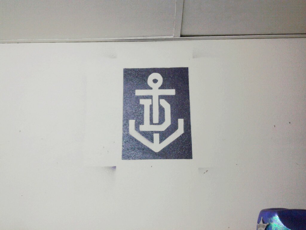
After a long consultative creation process, Block’s new design dropped the anchor, shed the red and green for an all-purple design with three white chevron Vs and replaced the Johnny Docker logo for a more traditional monogram insignia entwining an anchor with the letter ‘D’.
The rationale to give the team a harder, simpler, more professional look quickly had the players on board. With big Vs on the chests instead of anchors on the belly, they looked a stronger, more formidable outfit not to be trifled with.
Dockers legend and skipper at the time, Matthew Pavlich, says the design “felt bold and new, but with a distinct link to the past and the original Fremantle Football Club guernsey that we have previously worn during the AFL’s heritage rounds, in which we had often played well and won in. I thought it was a fresh look that the club and fans were ready to embrace.”
Pavlich says an early team focus group gave the design a thumbs up “but one player said, ‘the purple is great, but it has to be more ‘man-purple’, you know—darker’, which I think was taken on board.”
The new look quickly gelled with uncompromising on-field performances that led all the way to the Dockers’ first Grand Final in 2013. Channelled through the power of one colour, their on-field success marshalled the awesome, monochromatic force of the Purple Army, whose roaring sea of purple intimidated many visiting teams.
“That period 2010-2015 was when we got serious as a footy club,” Pavlich says. “The rebranding exercise and the new jumper design was a part of us growing up and becoming a formidable footy team.”
But there were times when those behind the rebranding must have felt like running for the nearest dugout to shelter from the barrage of anger from some fans.


ABOVE: 2009-2010—The brand and
uniforms were the result of an intense
eight months of exploration.
In a land where sport is a religion, staunch keepers of the faith saw it as a sacrilegious assault on the symbols of tribal fealty. Some likened the rebrand to an ambush when it was unveiled in October 2010 after a tightly held design development process by Block’s creative team under the secretive project name ‘Bob’.
Reactions on some fan sites were as bone-rattling as a Josh Carr hip-and-shoulder.
“I had arguments with lots of people—including my own family—but the guys all look tremendous out there.”
Dockerland condemned the demise of the anchor, the brawny docker emblem and the “ethnic cleansing” of the cosmopolitan red and green as a gross breach of the members’ trust. “The cards were marked in advance. The Docker man was dead before he even had time to check his shoulder for seagull poo,” it thundered.
On Big Footy, ‘C.S’ wrote: “I want to know who was commissioned to create the new ‘brand’? (Hope it didn't cost too much coz it looks kind of cheap). No doubt it was some dispassionate design company that doesn't quite get the spirit of Freo.”
But this rebrand wasn’t handled by a bunch of north-of-the-river, chardonnay-swilling interlopers. Block’s creative director Mark Braddock grew up an East Freo fan and has been a Dockers tragic since ruckman Mathew ‘Spider’ Burton took the first bounce in the club’s debut match on 1 April 1995.
The initial angry responses started to self-moderate over time as supporters weighed in to hose down the fire and brimstone.
“Judging by this thread, it seems a Freo supporter is one who has taste up his/her arse, wrote ‘McGarnacle’ on Big Footy. “Here's the club which most opposition fans agree are doing something right by taking the club's guernsey out of the 1990s and into forever, yet their own supporters are putting up the resistance.”
Vindication ultimately came through record membership numbers, new sponsorship deals, a jump in merchandise sales—which leapt from bottom of the AFL merch ladder to close to the top—and the heady appeal of wins on the scoreboard.
Both as a Dockers supporter and a brand specialist, Braddock had never loved the original club strip, which did evolve after 1995 to emphasise the purple, especially for the first Purple Haze match in support of Starlight Foundation 2003.
“It got better when they started minimising the red and the green, but for me it felt like it was a very marketing-driven thing in a moment in time,” Braddock says. “It was this very 1990s style, when cartoonish emblems were big in the NBA with franchises like the Charlotte Hornets. But we weren’t a franchise, we were a club.”


ABOVE: Early applications of the
identity circa 2010-2018.
In Everett’s 2014 book Fremantle Dockers: An Illustrated History to mark the club’s 20th anniversary, the then CEO Steve Rosich said it was imperative to grow the supporter base with a simpler identity. There also was a thorny issue of unlocking a logo dispute with the Levi Strauss clothing range ‘Dockers’.
Gary Walton, Club chief financial officer from 2002-03, told Everett the colours and brand messaging had to be simplified to appeal to a younger audience, particularly on social media. “I liked the change,” Walton said. “I had arguments with lots of people—including my own family—but the guys all look tremendous out there.”
“You can’t please everyone and as always, there was a section who loved the red, green and white anchor. But I think there was mostly great support from the fans—both ours and even the opposition’s—about the change.”
Former Club President Steve Harris says purple was always strongly associated with Fremantle. “People don’t talk about ‘the purple, red and white army’ or ‘the Purple, Red and White Haze Day’. If you look at great clubs and great brands, simplicity lies at the centre.”
Braddock says the rebranding exercise was about imagining “going back and doing the version that maybe should have been done originally, with the tone being solid, simple, direct and timeless”.
The brand built on the heritage of a traditional football club and the industrial heritage of Fremantle, he says. “And then we went to the stencil symbol that could be almost spray-painted on the side of a ship, like a maritime or naval shield. And the typeface was hard and straight-edged. There's nothing soft about it.
Well, now there's a bit of a history to things whereas back then merch wasn't selling and nobody wanted to wear a red, white, purple, green T-shirt. Ironically, that's now changed because it's retro and it’s cool.”
Pavlich agrees that the rebrand helped create an instant archive of 1995-2010 heritage jumpers for fans of a young club to share a nostalgic connection.
“You can’t please everyone and as always, there was a section who loved the red, green and white and the anchor. But I think there was mostly great support from the fans—both ours and even the opposition’s—about the change.”
Perhaps the final word ought to go to an anonymous fan on Reddit, who remembered being bullied as a kid for wearing the gaudy green, red and purple gear. “The club's greatest era came after the complete rebranding and to move away from the old culture,” he wrote.
“Now all those people that bullied me are saying how awesome these old shirts are. The club isn't a basket case anymore. Because of the rebranding, we can look back at these jumpers with pride and admire that they actually were nice and pay homage to the era. The Club needed to move forward in order to look back on the past fondly.

A Note on Heritage and Change
When we had set out to rebrand the Fremantle Dockers, the intention was never to erase the Club’s original identity, which was designed by the late Neil Turner. That heritage is the bedrock—the colours, the anchor, the stories, the early myths. The new and the old together form the Club’s DNA; its fingerprint. I’ve always loved Heritage Round for that reason, and the heritage merchandise too: it gives the Club depth, a layered history each new generation can step into and make their own.
A rebrand should never be an act of disrespect to what came before. It should honour the past and make space to celebrate it.
The current identity is one layer in an ongoing palimpsest, and in time it will morph as well. The next layer will be laid over this one, as has happened with every successful club and every successful brand. That is how vitality enters and how a culture stays alive.
We honour what came before—the old Fremantle Football Club identity—while acknowledging that energy, confidence and life that comes from change. The heritage remains. The story deepens. And the purple we wear today sits alongside everything that made us Freo in the first place.
— Mark Braddock
Co-Founder & Creative Strategy Director, Block
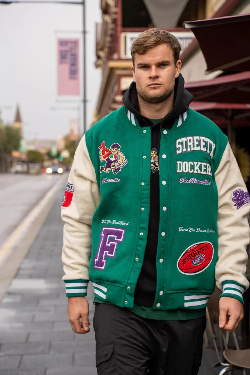
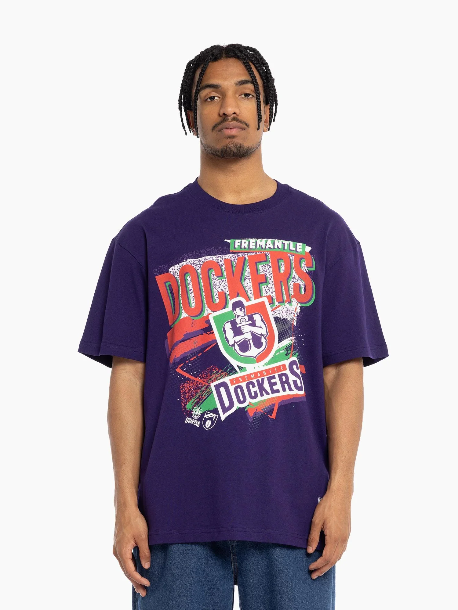
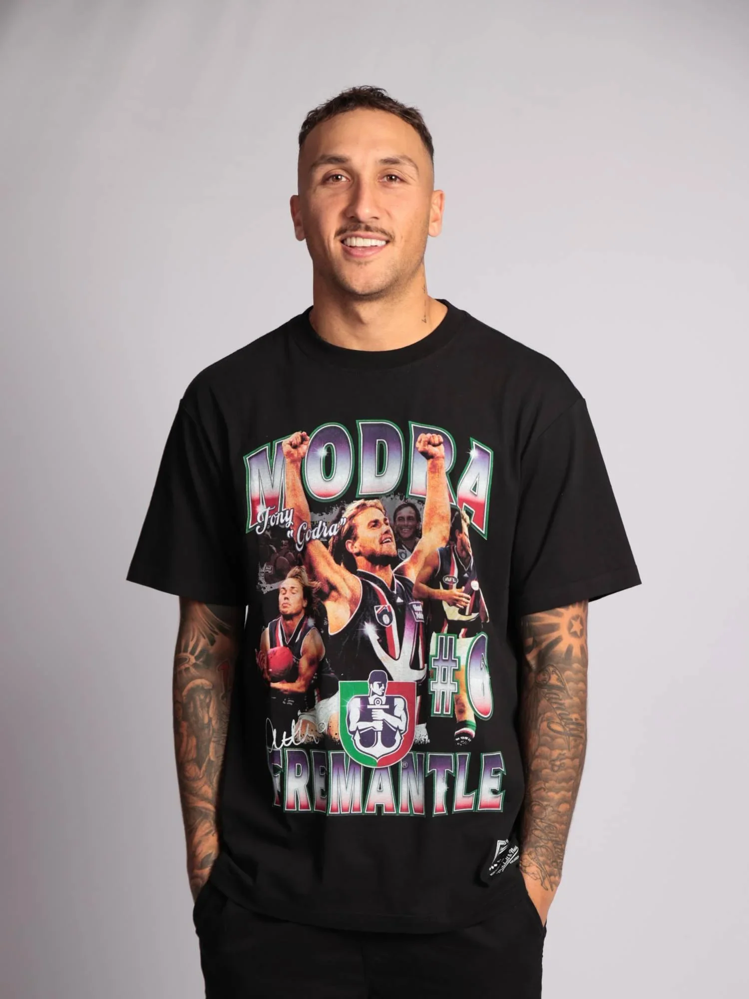

ABOVE: Riding the neo-nineties
trend. Images courtesy of
StreetX and Mitchell & Ness.