Agency Provocateur: ReBranding (and RE-Rebranding) in the Age of ‘Add Comment’
By Max Veenhuyzen
When PICA approached Block to create a new identity for the maverick art gallery, both parties agreed to be bold and take the road less travelled.
The journey didn’t go quite as planned.
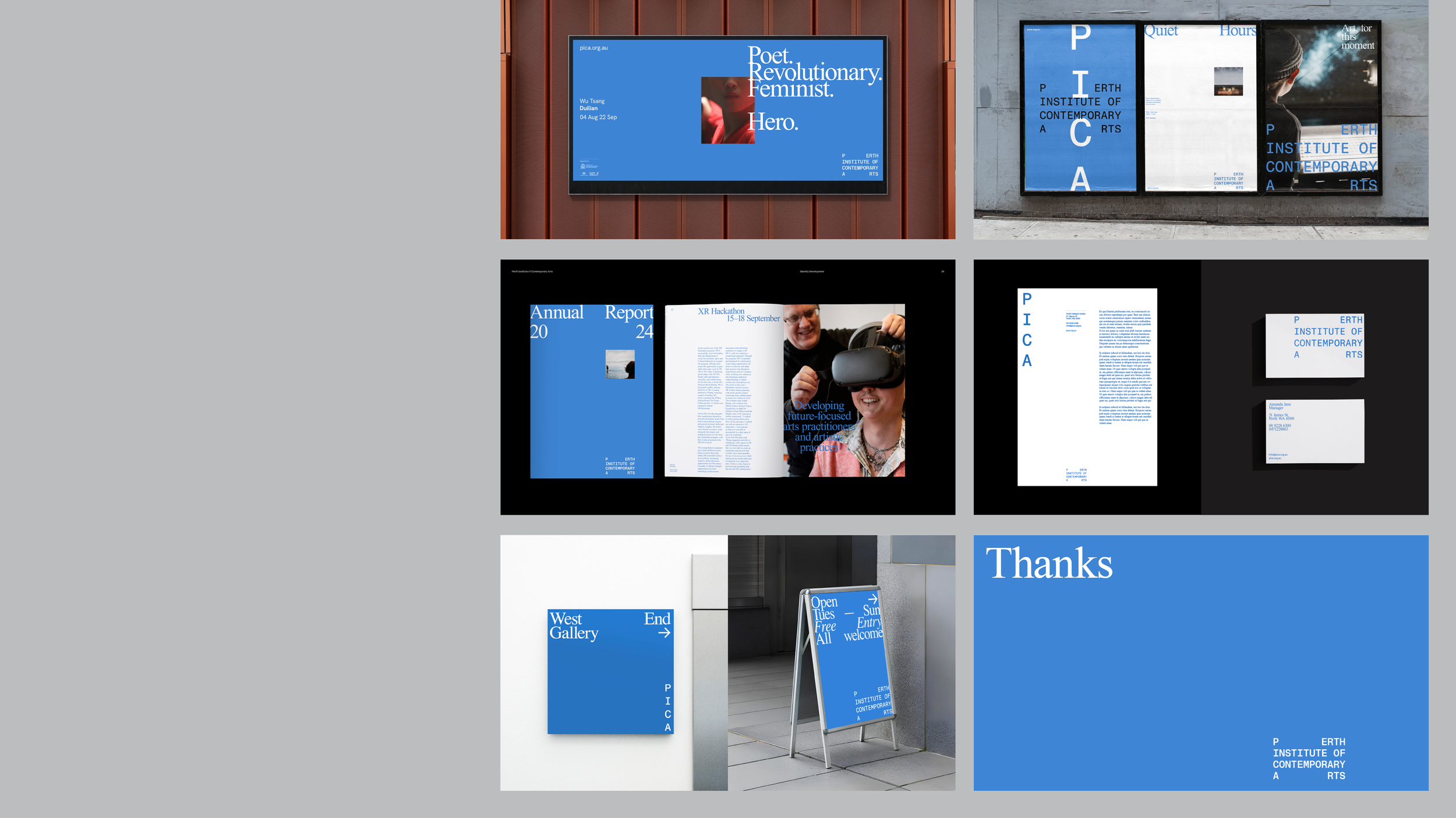
WHEN THE Perth Institute of Contemporary Arts (PICA) unveiled its bold new look in 2024, keyboard warriors were quick to share their thoughts.
“Finally some identity work that’s not afraid to be a little weird!” commented Larry on Brand New, the influential design blog Under Consideration.
“It’s evocative, interesting, uncomfortable,” writes Drew. “You know what you’re getting into as soon as you see it, which I think is what a brand should do.”
However, not everyone was as excited as Larry and Drew about the gallery’s new look. “I feel this is one of those examples,” offers Izabela. “Just because you can doesn’t mean you should.”
Block founders Tanya Sim and Mark Braddock, meanwhile, weren’t bothered whether people loved the redesign, hated it, or did a bit of both. What mattered to them was that the work created a reaction.
“Yikes, that typeface is horrific.”
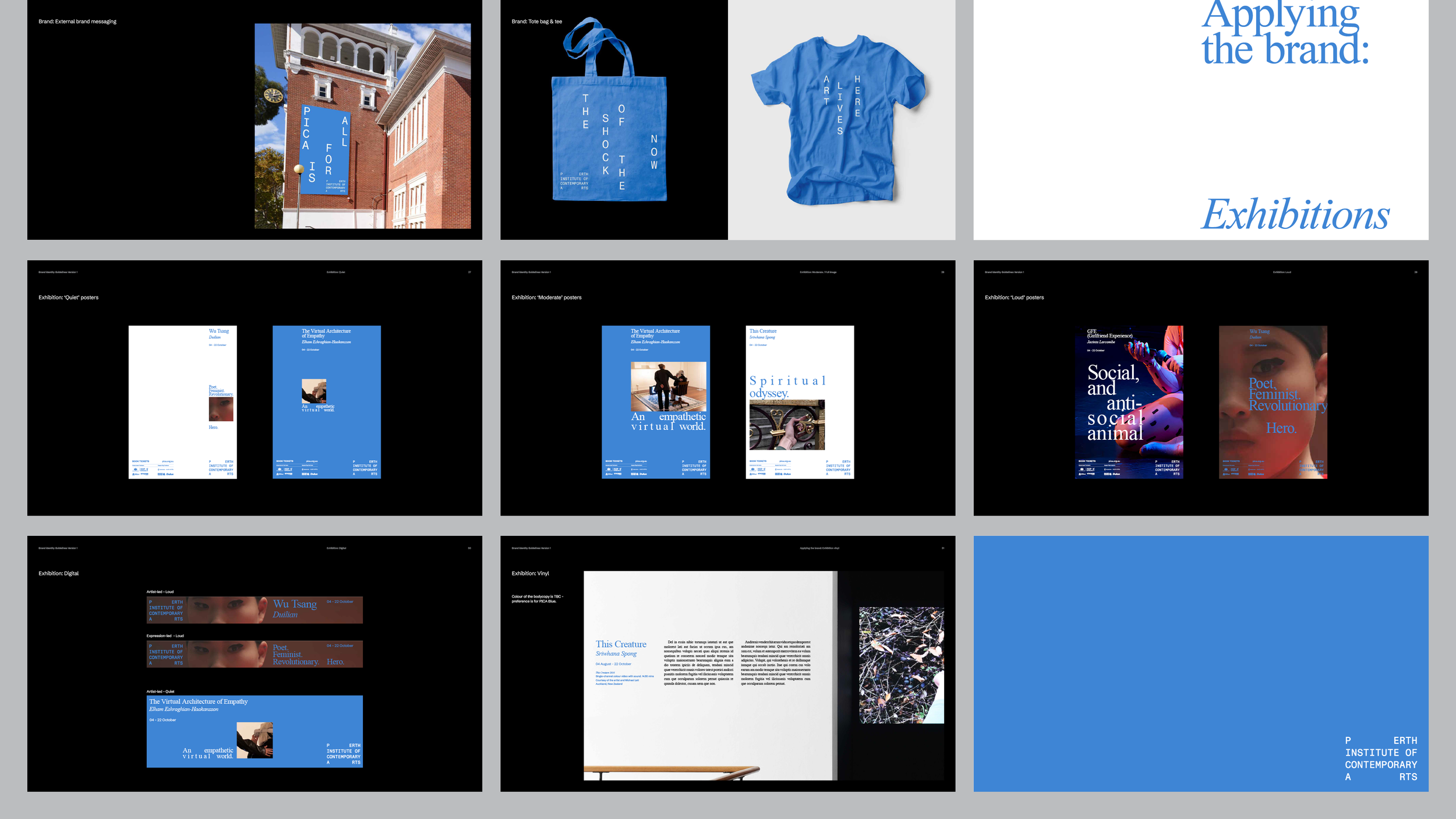
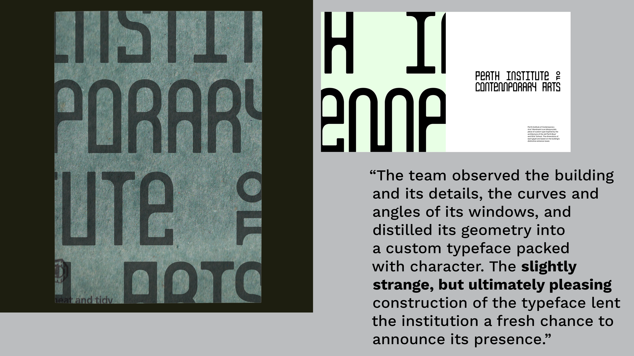
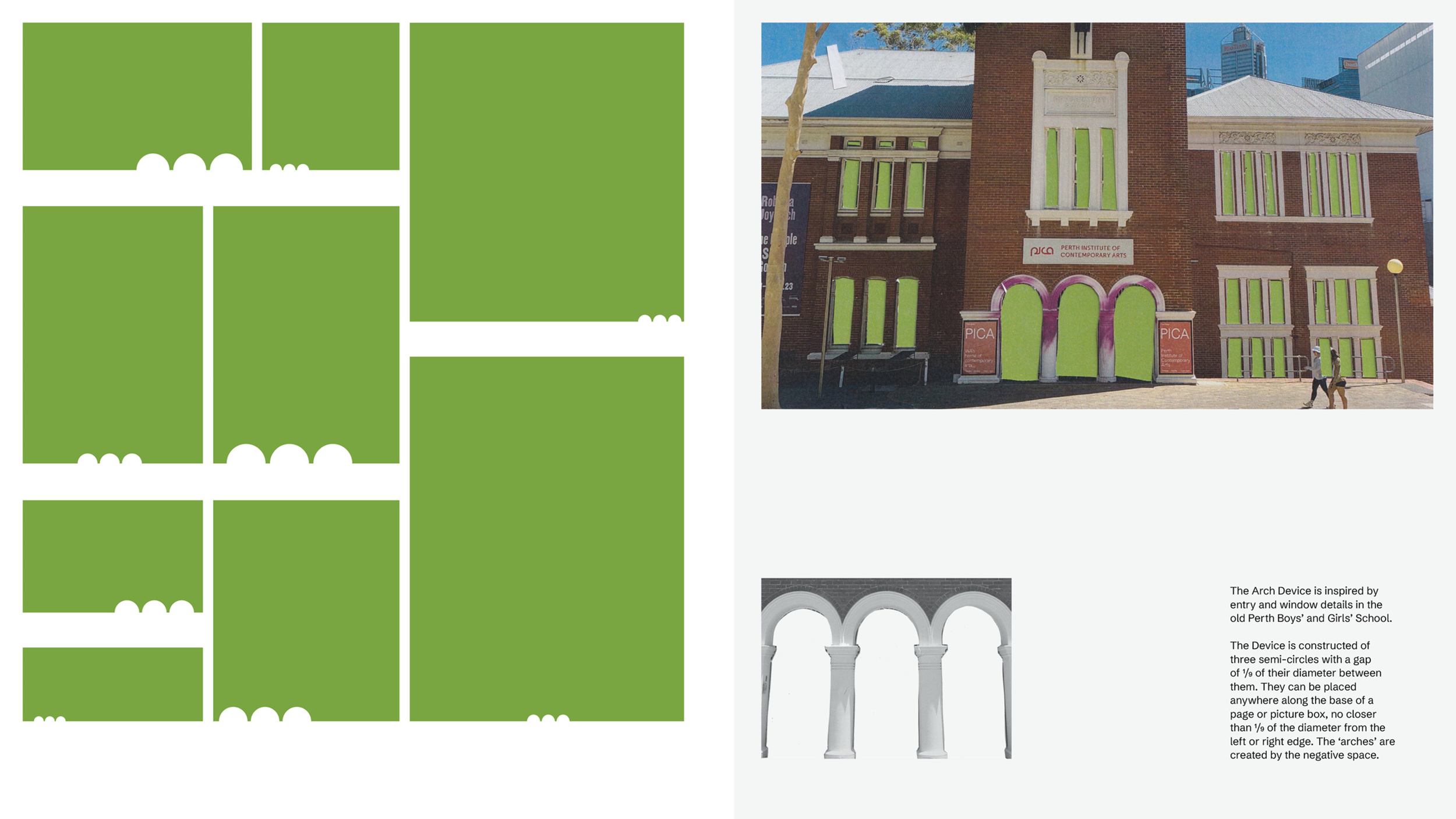
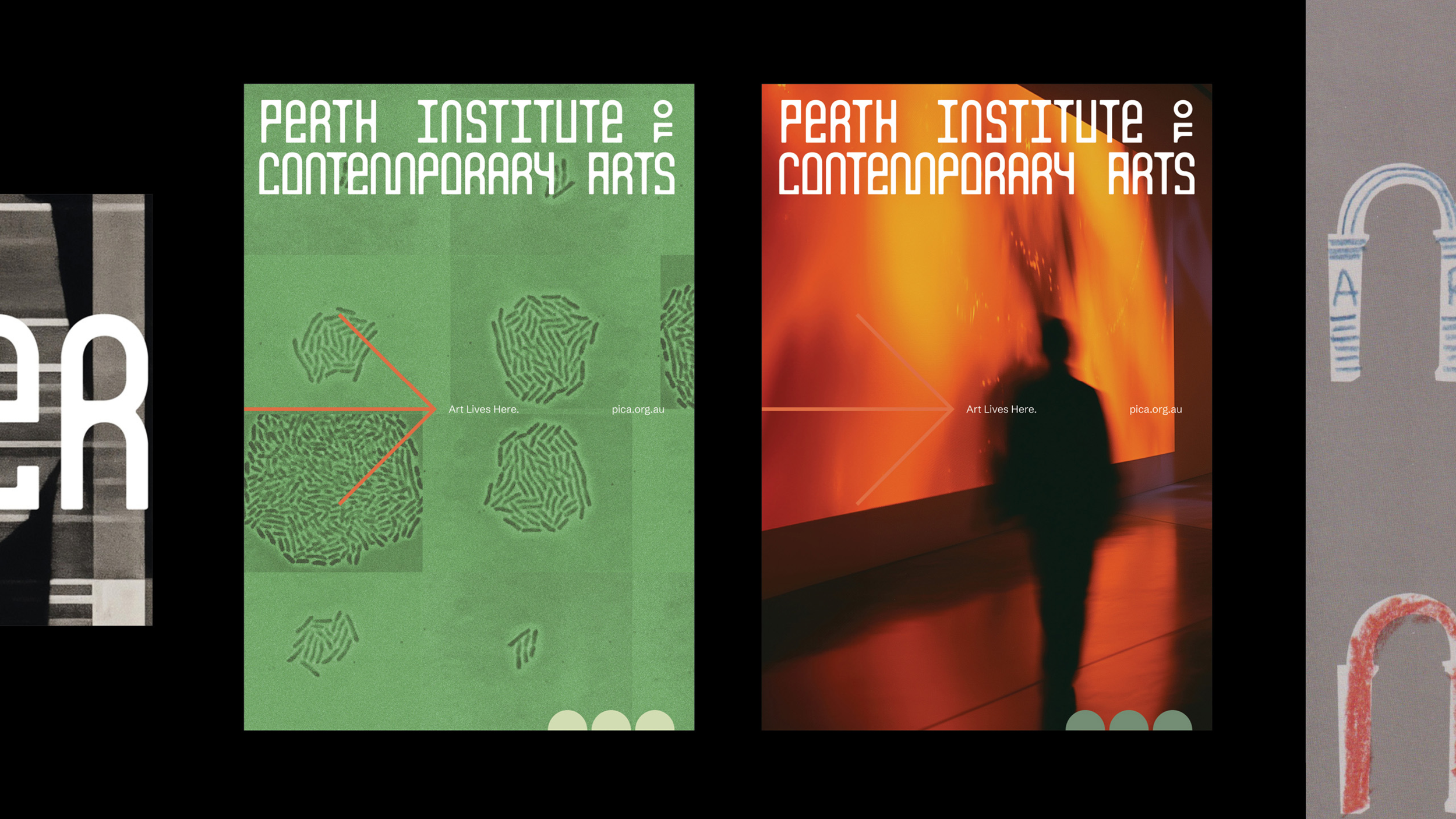
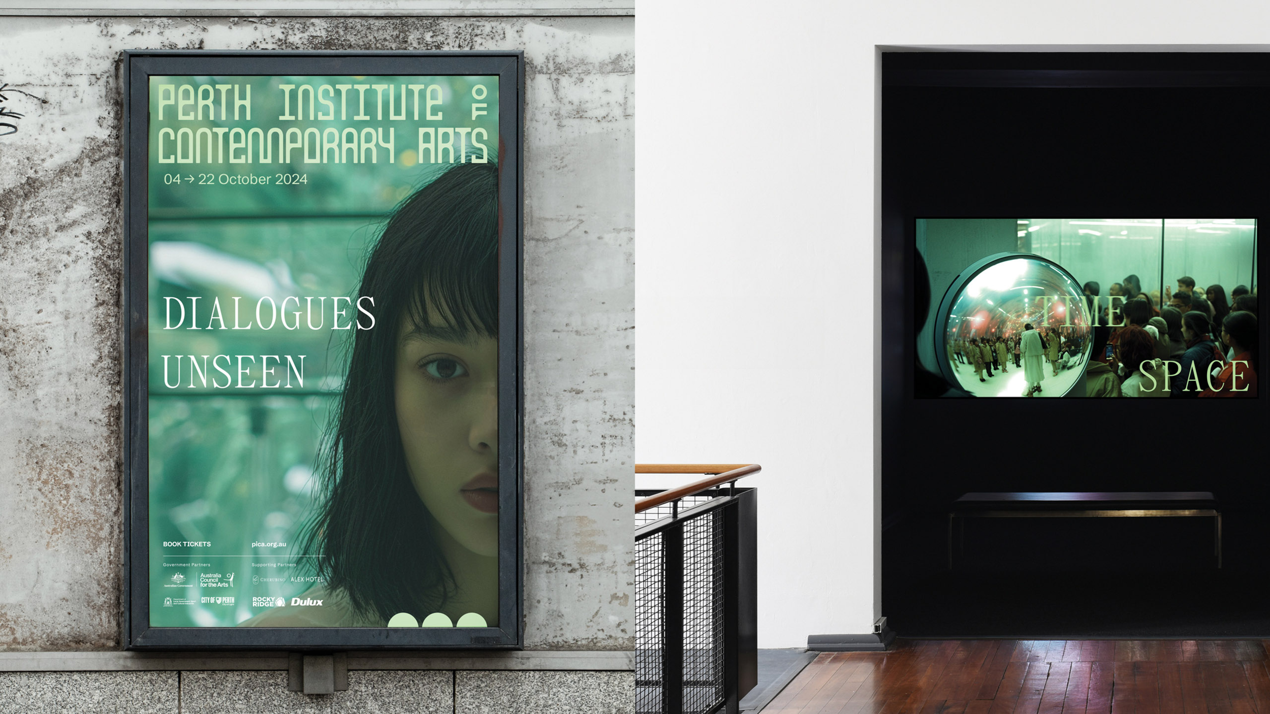
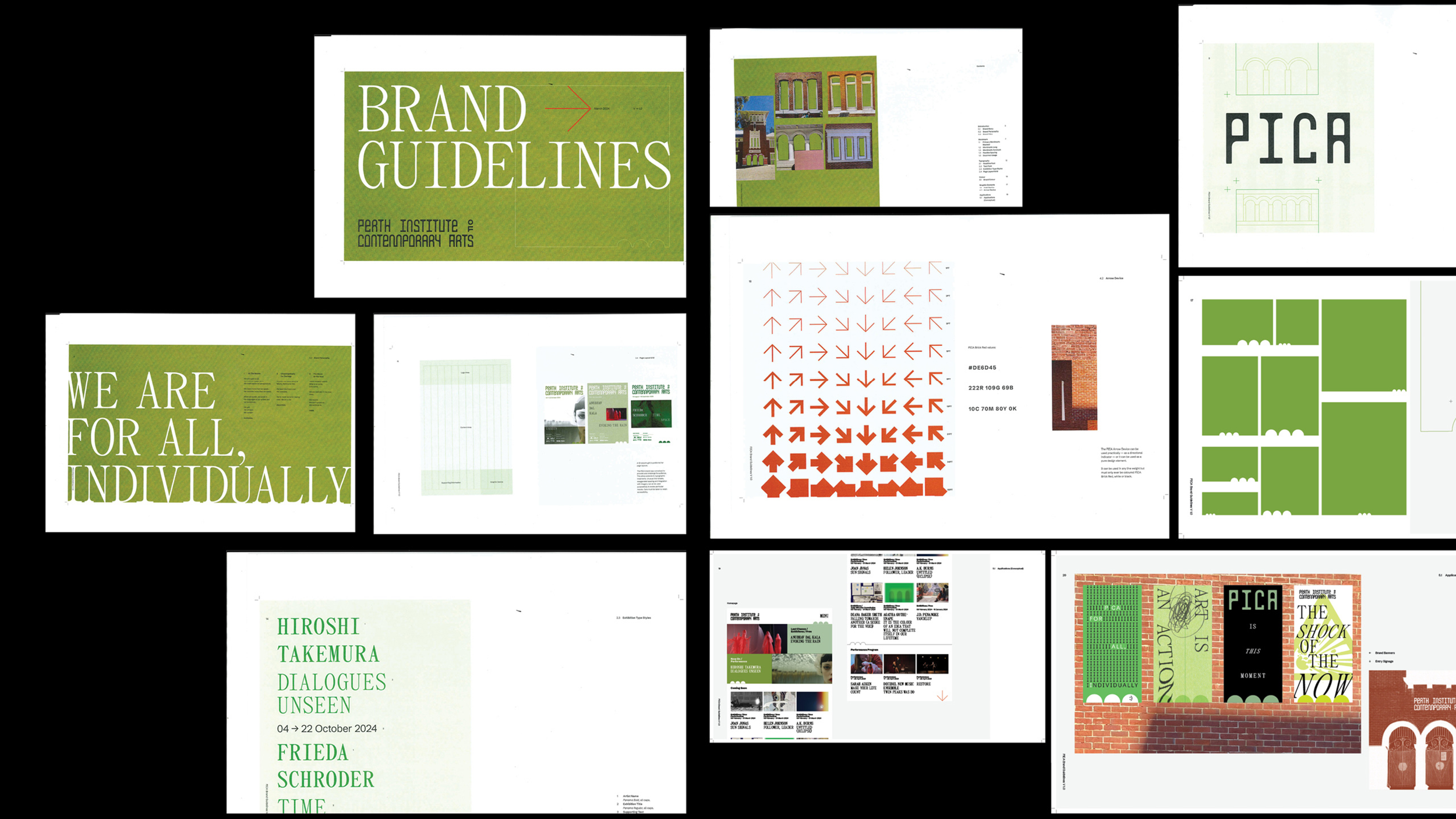
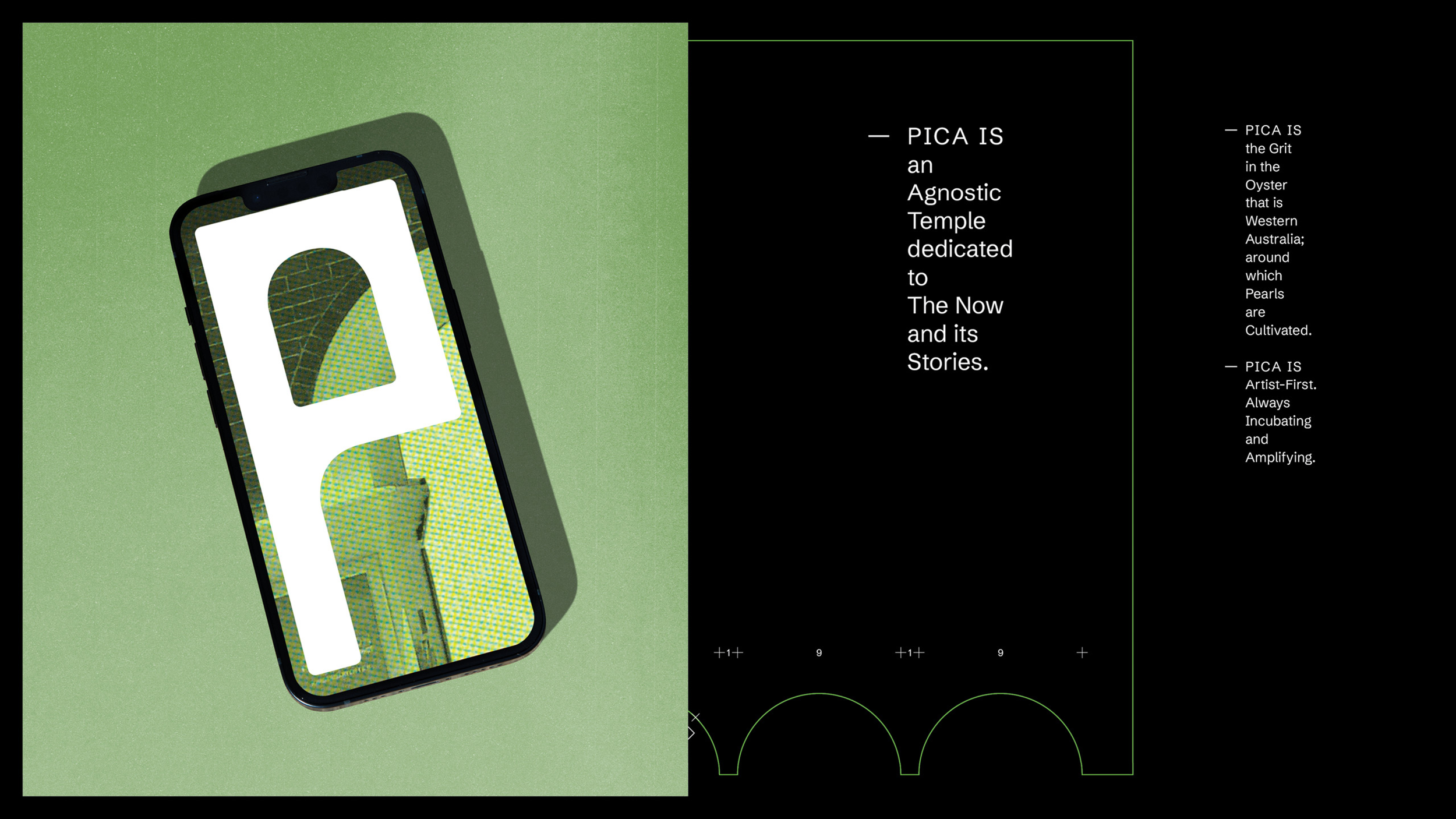
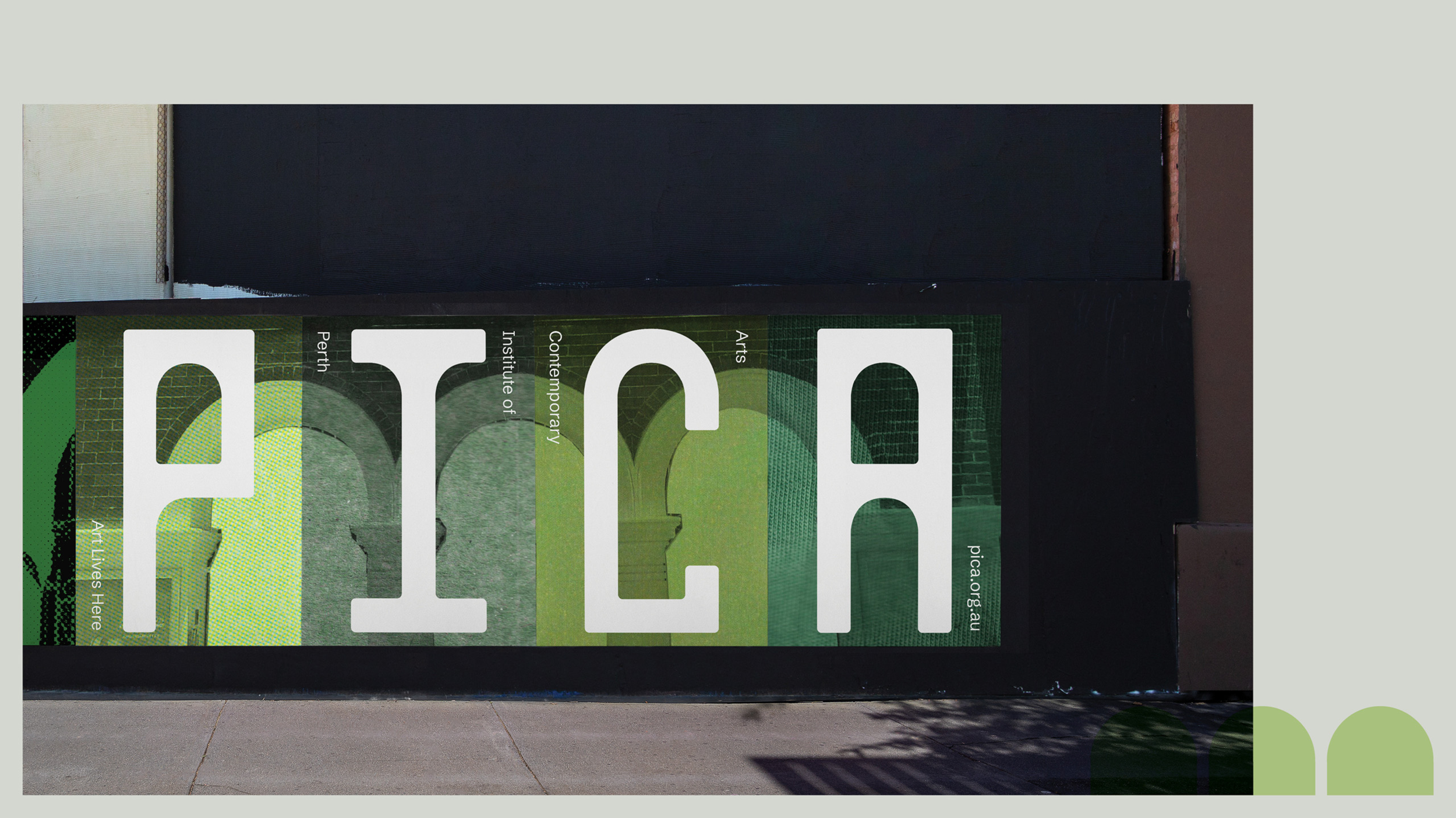
“Yikes, that typeface is horrific,” bluntly states a commenter with the mononymous username, Ramen. (Ramen clearly wasn’t a fan of PICA’s bespoke new wordmark inspired by the Gothic Revival arches and architecture of the historic Perth Boys School building that the gallery is housed in.) “Smacks of the stuff I made when I was in my first year at college and tried to explain to everyone that it wasn’t bad, that they just didn’t understand it. Turns out they did.”
And then there were those that had a foot in both camps, not least London-based designer Matt Hauke, the guest writer behind the blog’s Arch Nouveau review that these comments have been lifted from:
“In the end, I’m quite torn on this,” writes Hauke. “But beauty is subjective, and I find myself a bit weary of traditionally beautiful brands. Ultimately, branding is about a feeling, it’s about attitude, and this identity has plenty of it.”
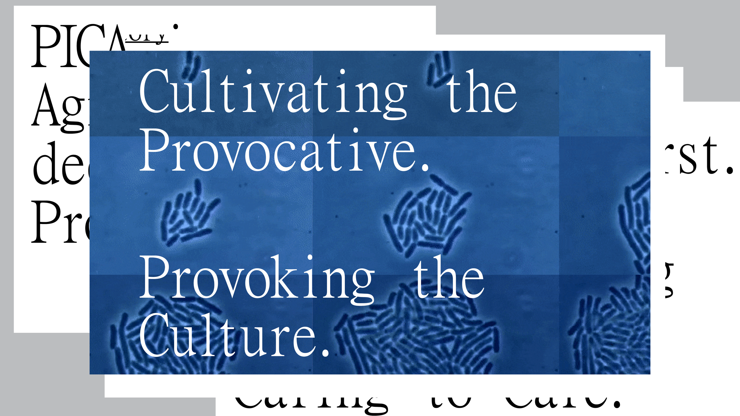
“When we launched, there were some negative comments about it, and that’s good,” says Tanya. “As creatives, you tend to be very precious. The whole point [of PICA] is provocation, so there’s a lot of self-reflection in the work.”
“It provoked some really interesting discussion internationally, which is kind of nice,” Mark adds. “And if it had been a smoother process, we may have not ended up here or forced to push ourselves as far as we did … or to revisit it.”
Revisit it?
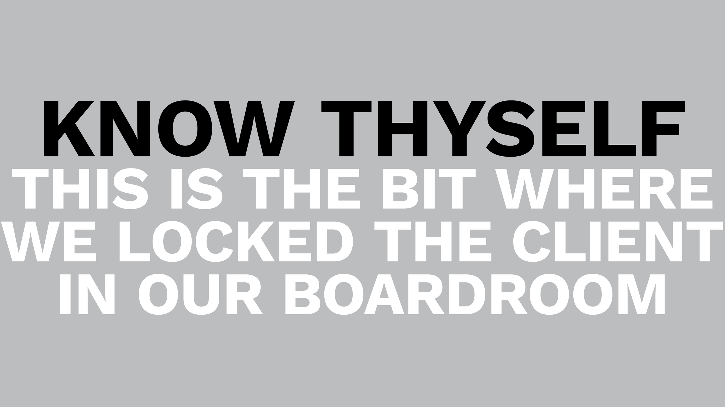
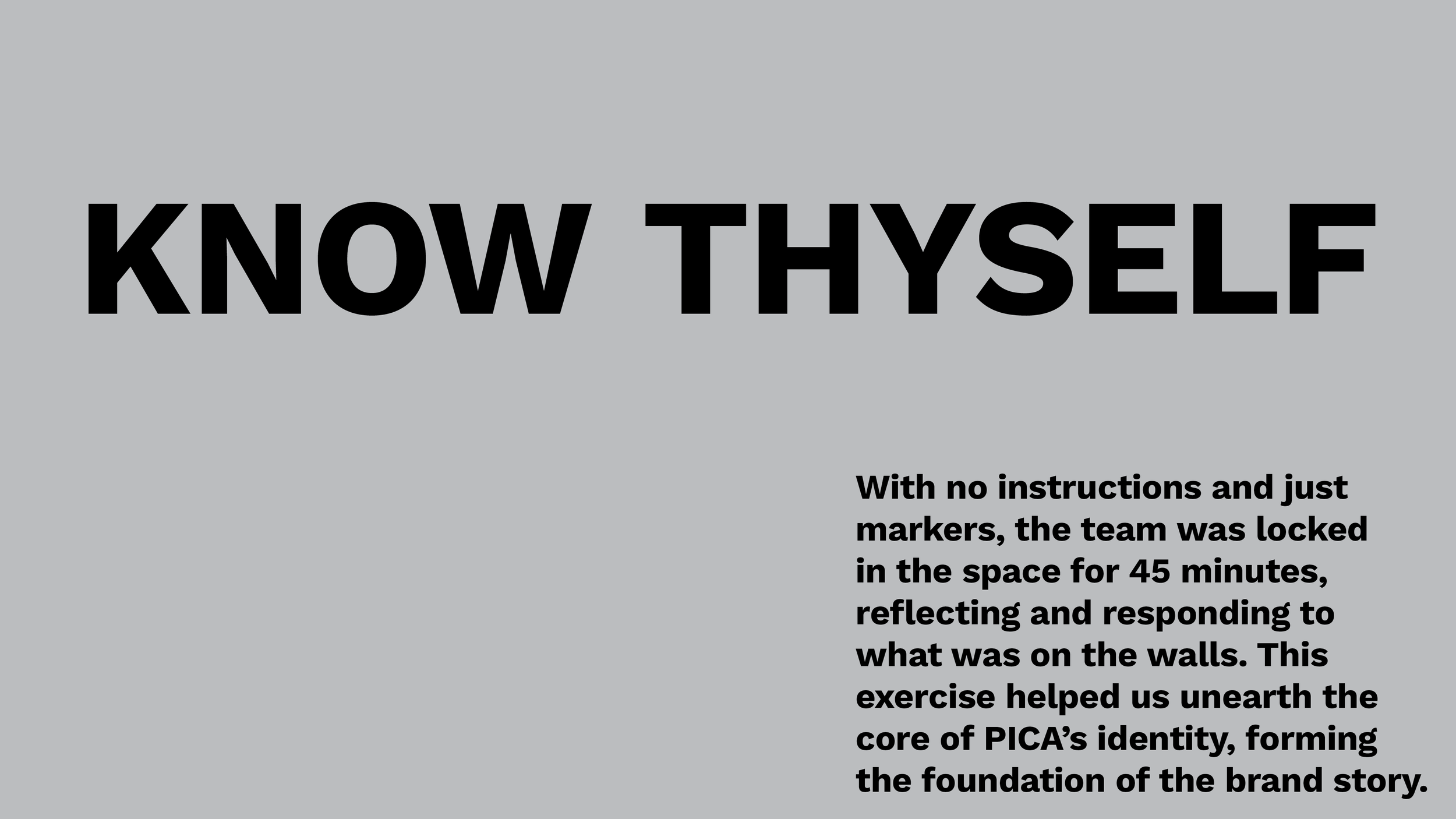
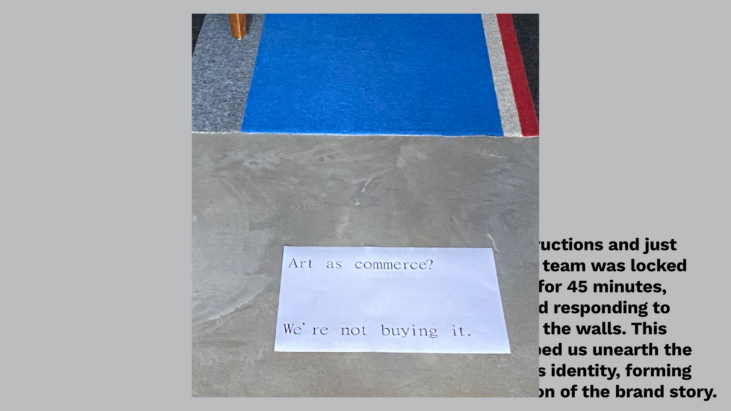
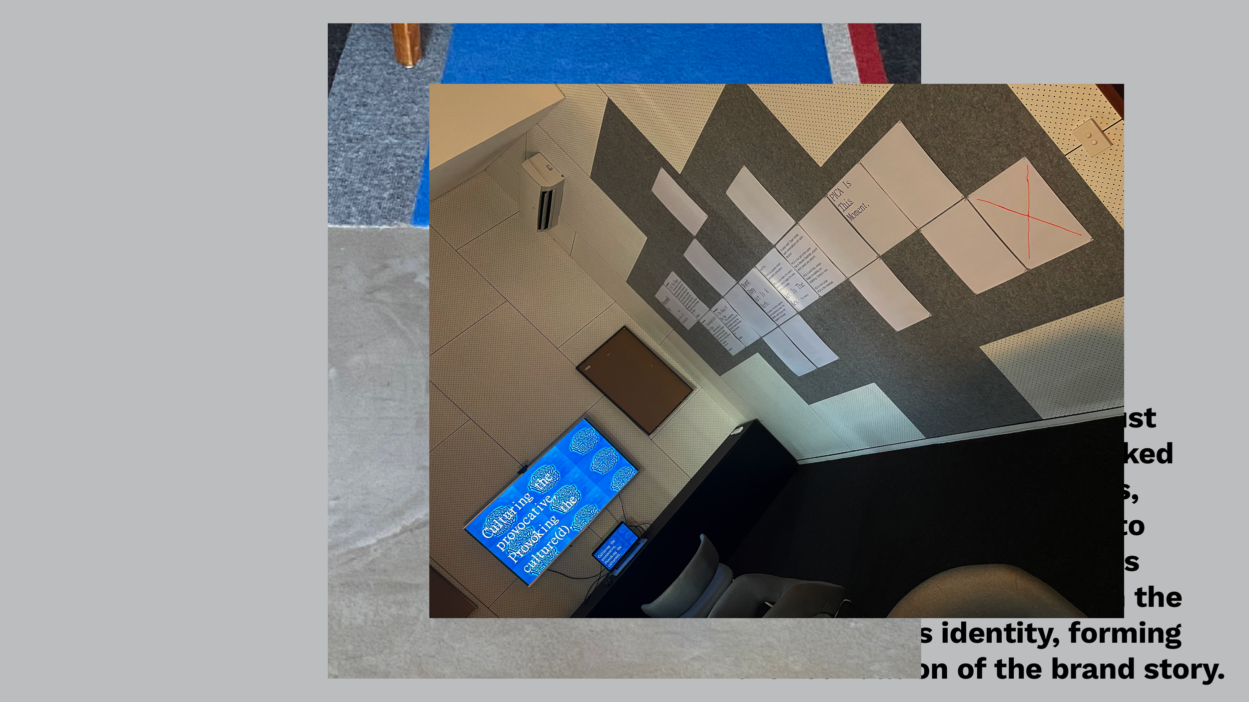
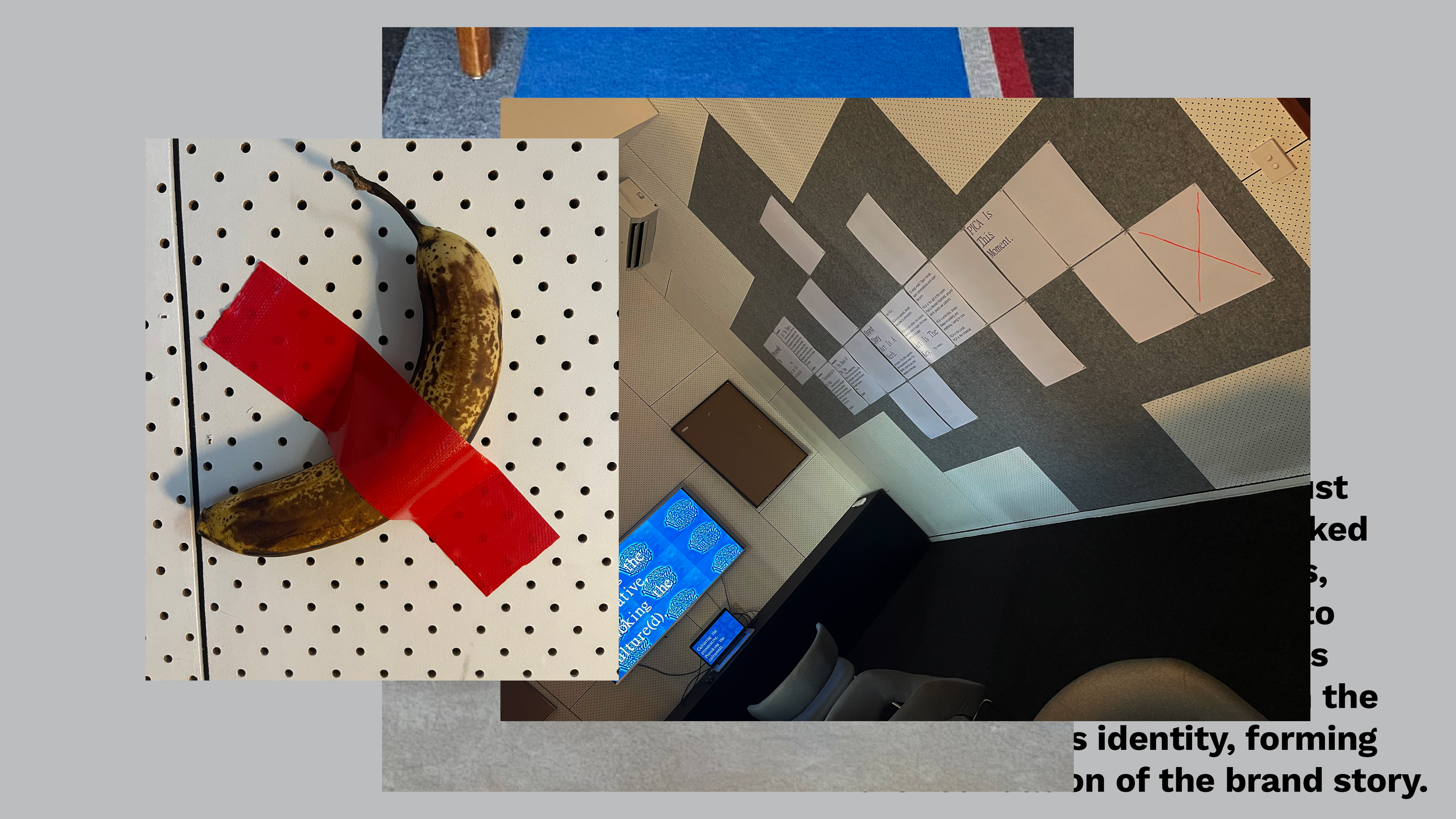
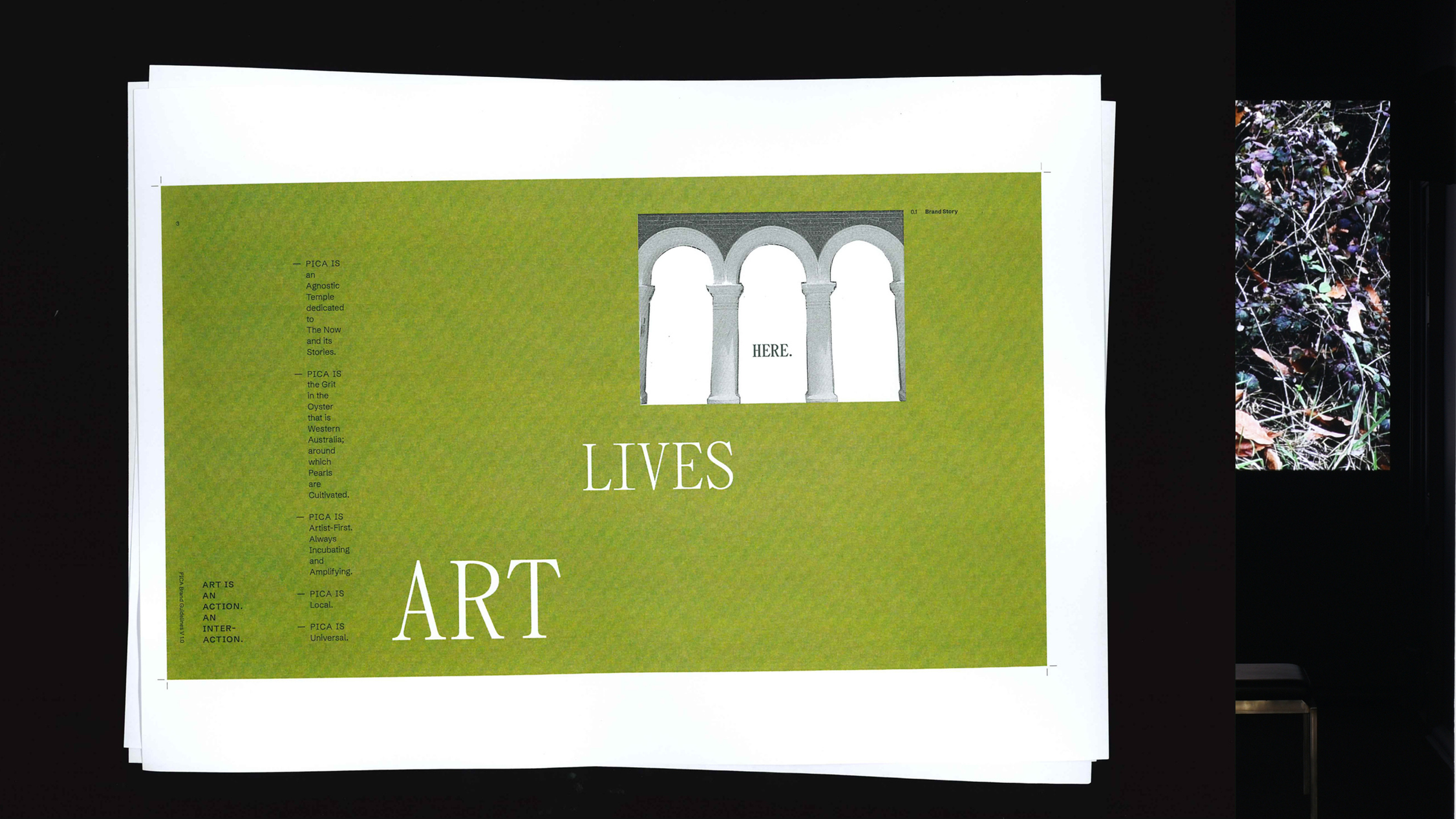
ABOVE : Is your process
fit for purpose? With no
instructions and just
markers, the PICA team
was locked in the space
for 45 minutes, reflecting
and responding to what
was on the walls. This
exercise helped unearth
the core of PICA's
identity, forming the
foundation of the brand
story. (From Telling
Babies from Bathwater:
A Rebranding Field Guide,
2024 Fremantle
Design Week)
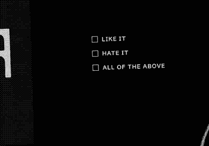
In a case of what’s good for the goose being equally good for the arts administrator, an early presentation involved locking PICA’s management team in Block’s boardroom along with a video presentation, posters emblazoned with provocations, drinks, 45 minutes on the clock to digest it and zero instructions.
“They want their audience to sit in an uncomfortable space and be provoked: so what happens when they have to do it?” was Mark’s thinking.
Unfortunately, reflecting on a brand’s identity is one thing. Translating those reflections into a visual medium is quite another. This escape room-style exercise might have unearthed plenty of insights for Block to work with, but outside, after eight months of back-and-forth, this consultative-style approach culminated in a beautifully ‘safe’ rebrand that wasn’t quite what either party had in mind.
“All the edges got polished off and it just ended up being very ‘expected’ for a contemporary art gallery.”
“All the edges got polished off and it just ended up being very ‘expected’ for a contemporary art gallery,” says Mark.
“It was good—very good—but you could switch out any contemporary art space for it. It was like, where’s the actual PICA? It was just clear that nothing in here [the original brand identity] was the actual problem.
“The actual problem was we ended up with something that fit perfectly. We started trying to stand out from this group and we ended up creating something that sat perfectly with them.”
PICA agreed and so both parties went back to the drawing board (well, went back to reinvent the drawing board): not ideal considering it was December and developing a new identity meant somebody was getting a new holiday project for Christmas. (That someone, of course, was Mark.) But this time around, he ditched the group project approach and worked solely with PICA CEO and Director, Hannah Mathews: “a breakthrough”, says Tanya, “that wouldn’t have happened without the first run.”
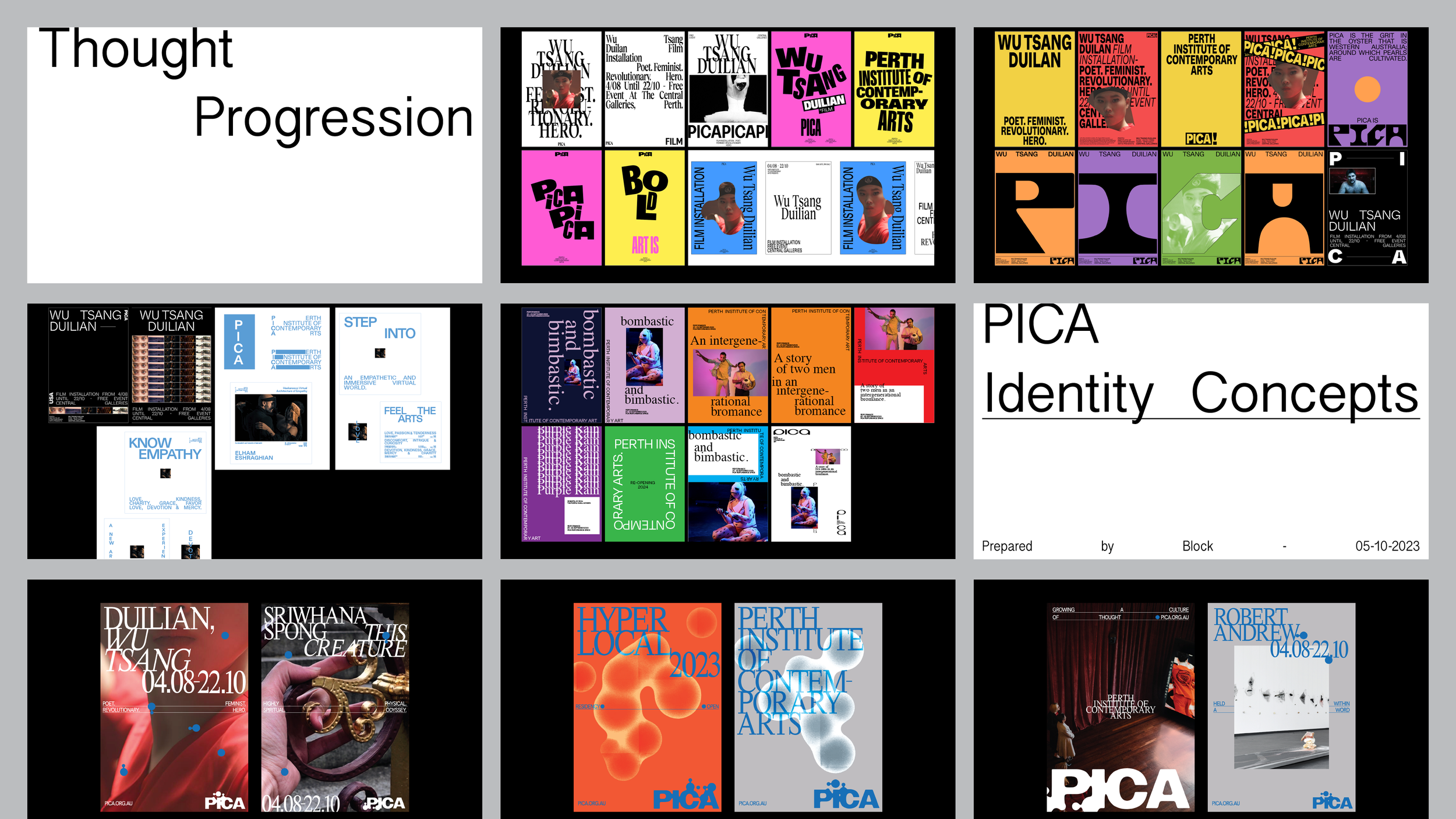
ABOVE: Creative Development
and final design of the initial
identity. (From Telling Babies
from Bathwater: A Rebranding
Field Guide, 2024 Fremantle
Design Week)
“It would have been stupid to do the same thing again and hope for a different outcome,” she says.
Downshifting to a one-on-one format wasn’t the only switch-up for round two.
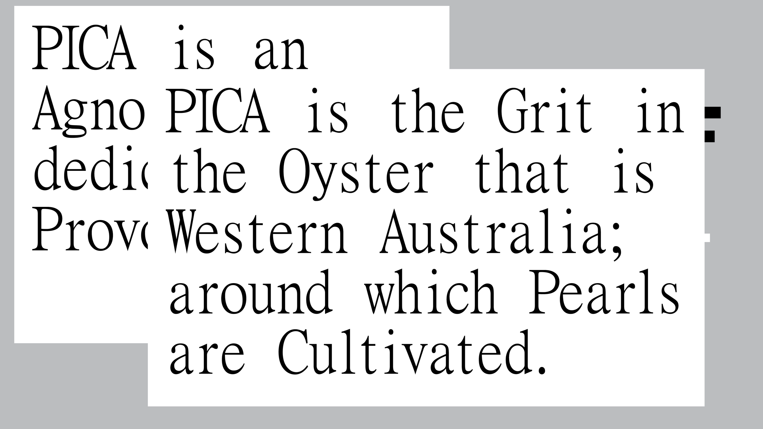
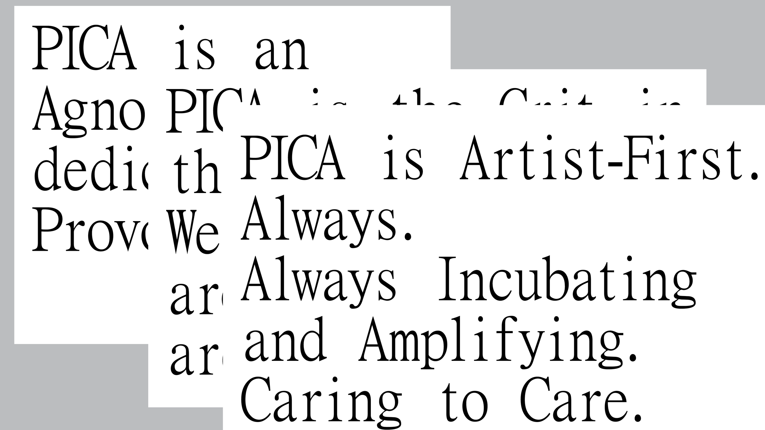
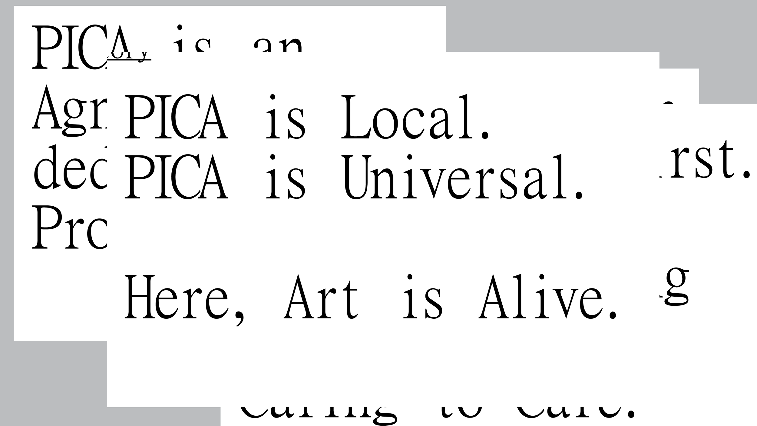
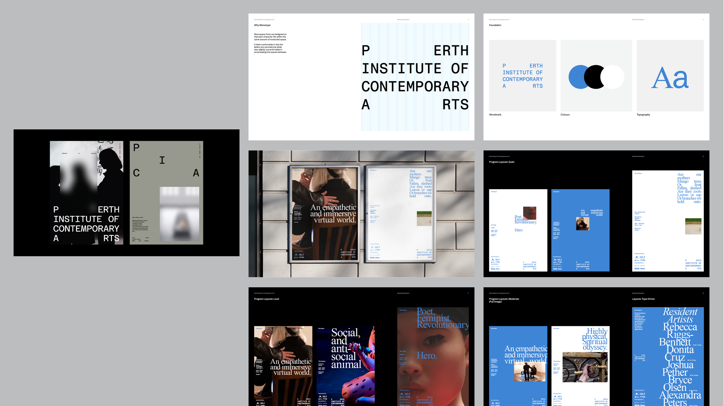
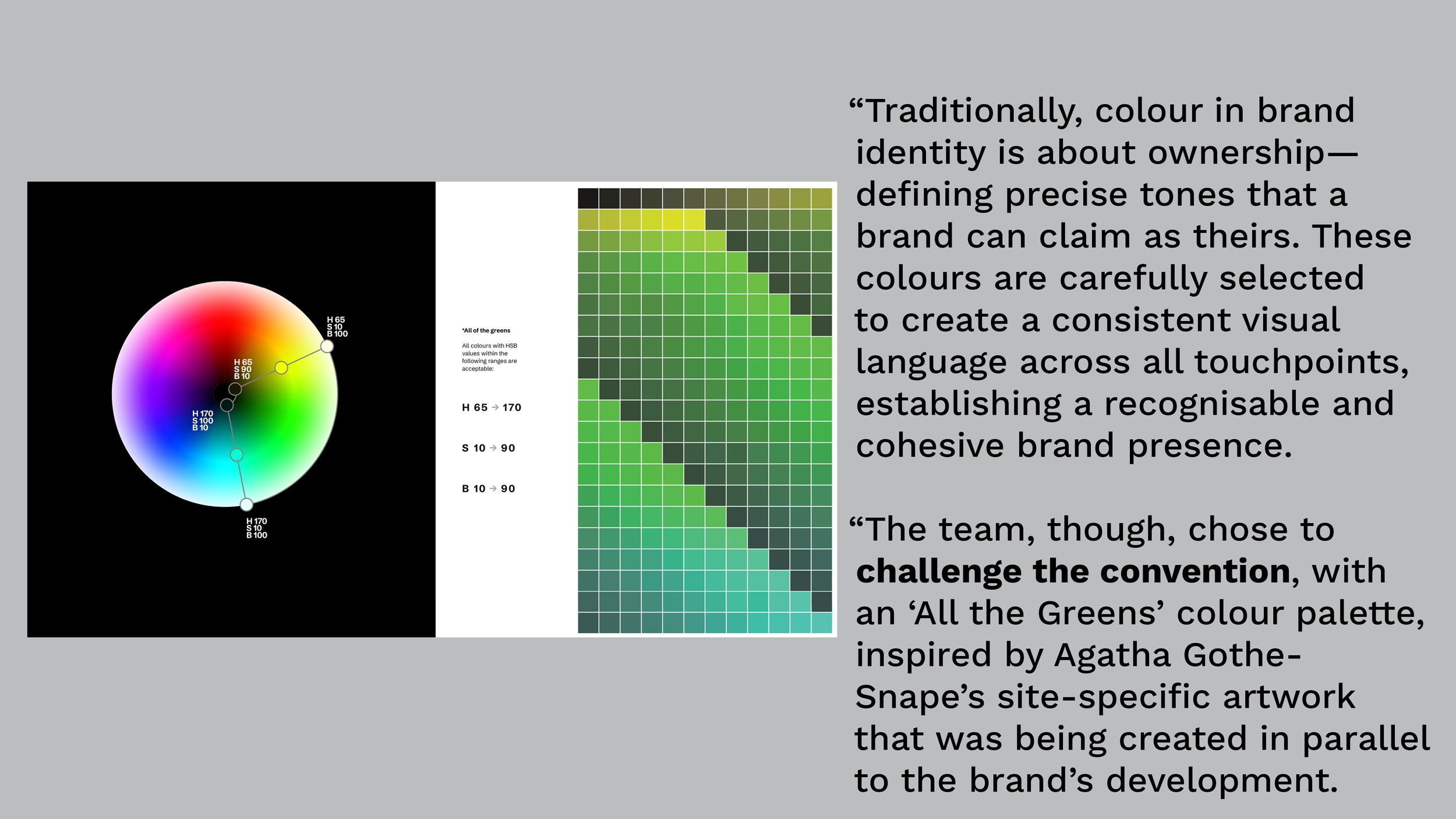
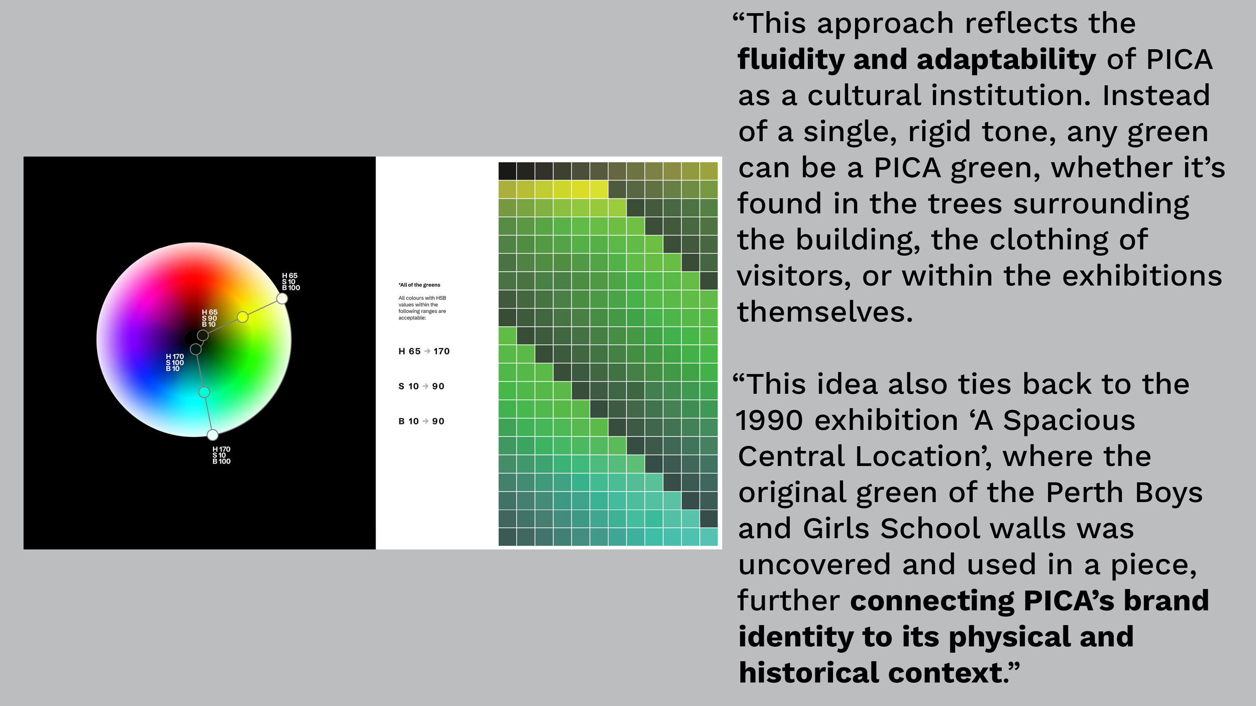
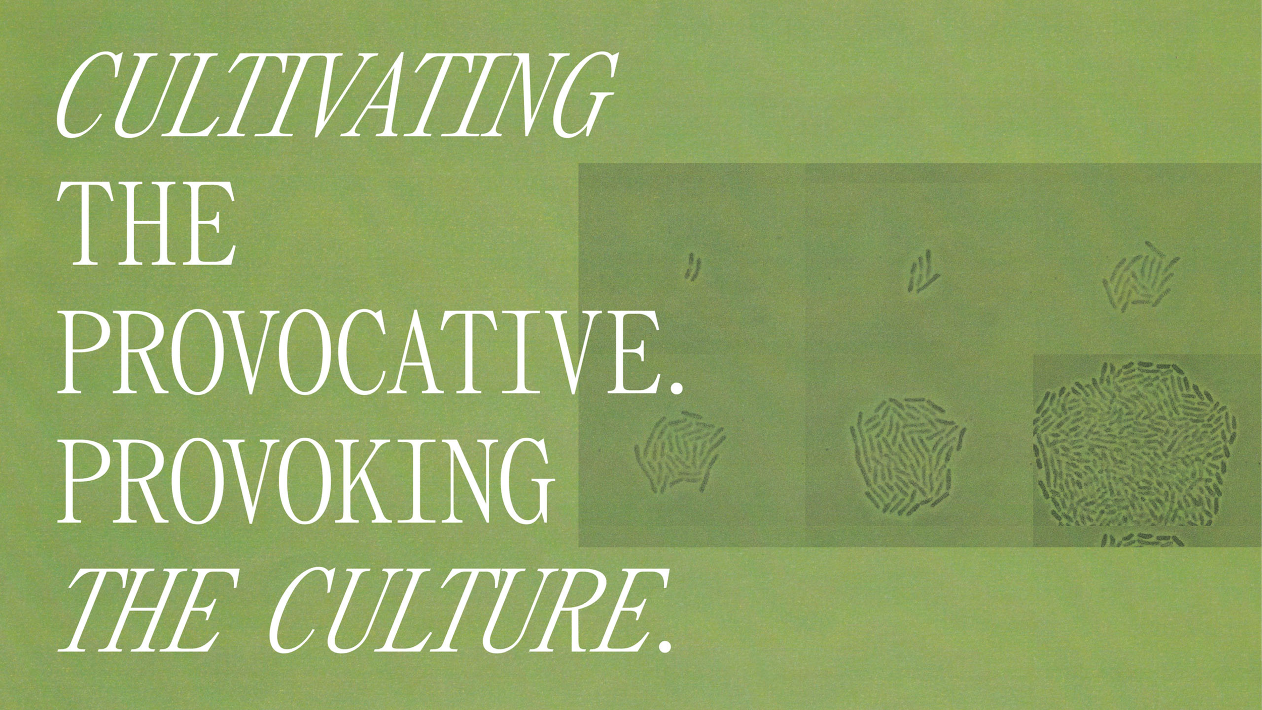
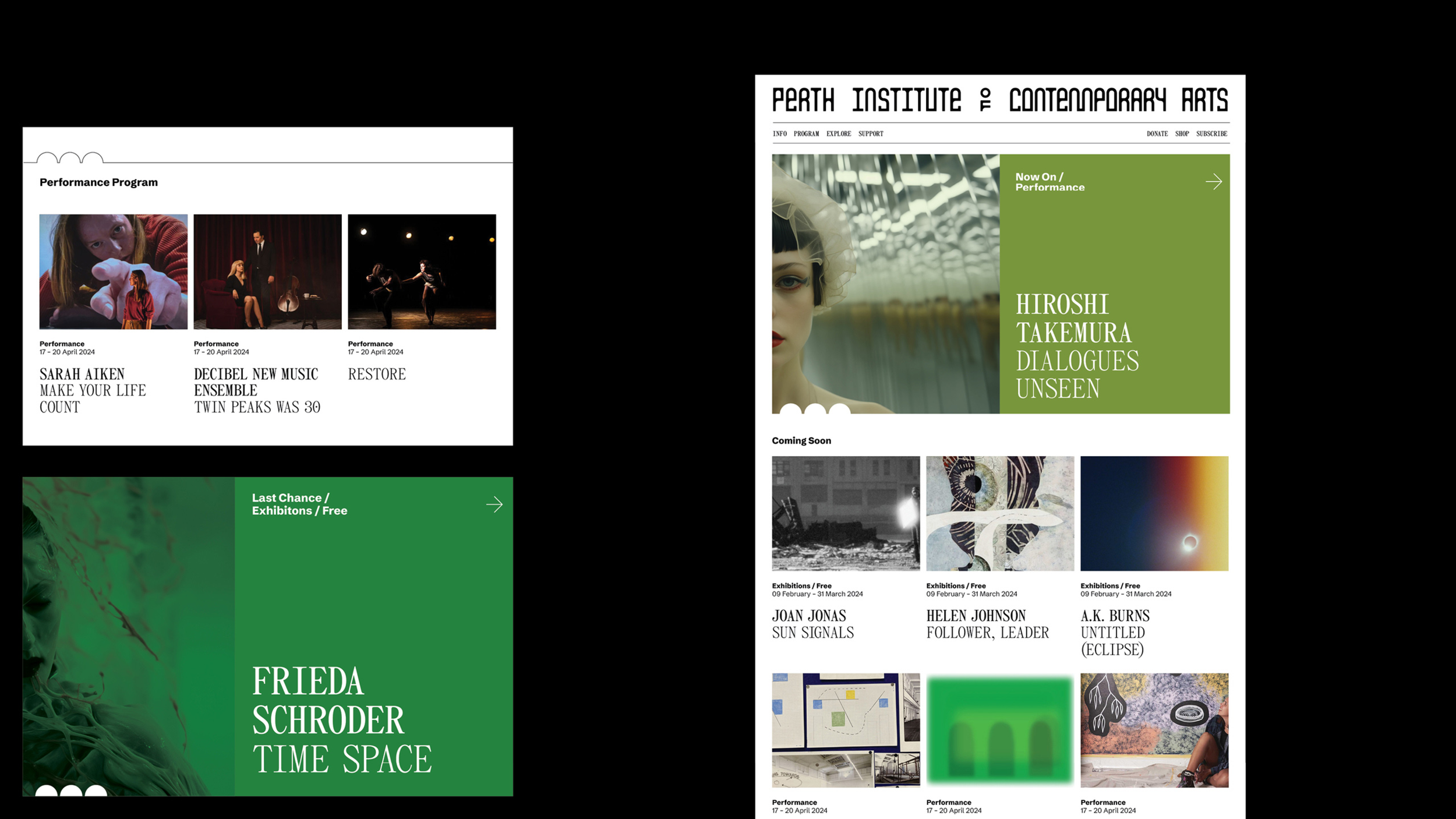
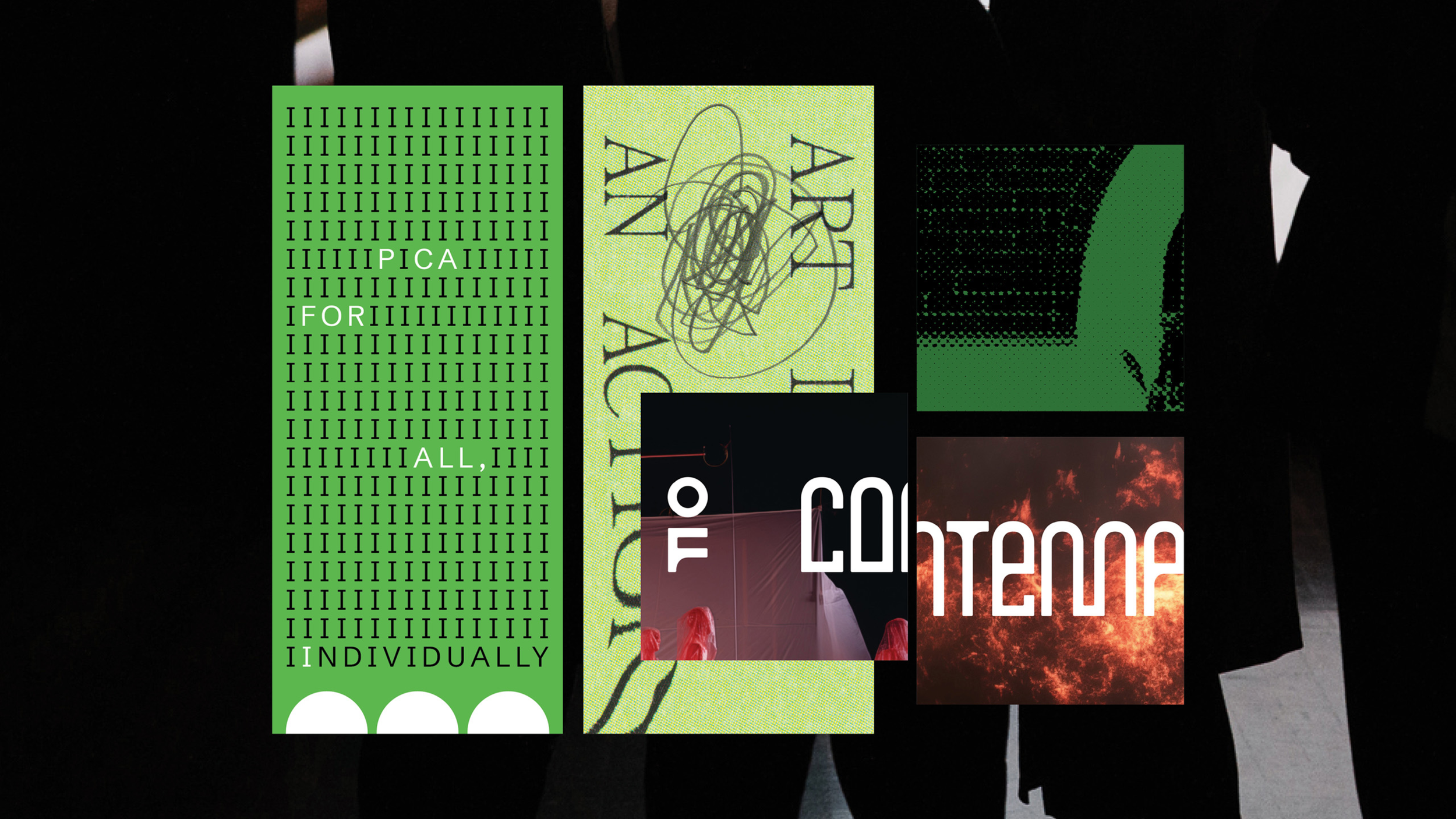
PICA had also commissioned artist Agatha Gothe-Snape to produce a site-specific artwork that referenced the original green base coat that the school’s walls were painted in. This discovery fuelled the radical idea to commandeer ‘all the greens' for PICA’s identity. (Mark: “From a branding sense it’s un-corporate, absurd, but also kind of funny and makes you think. A bank would never do it.”)
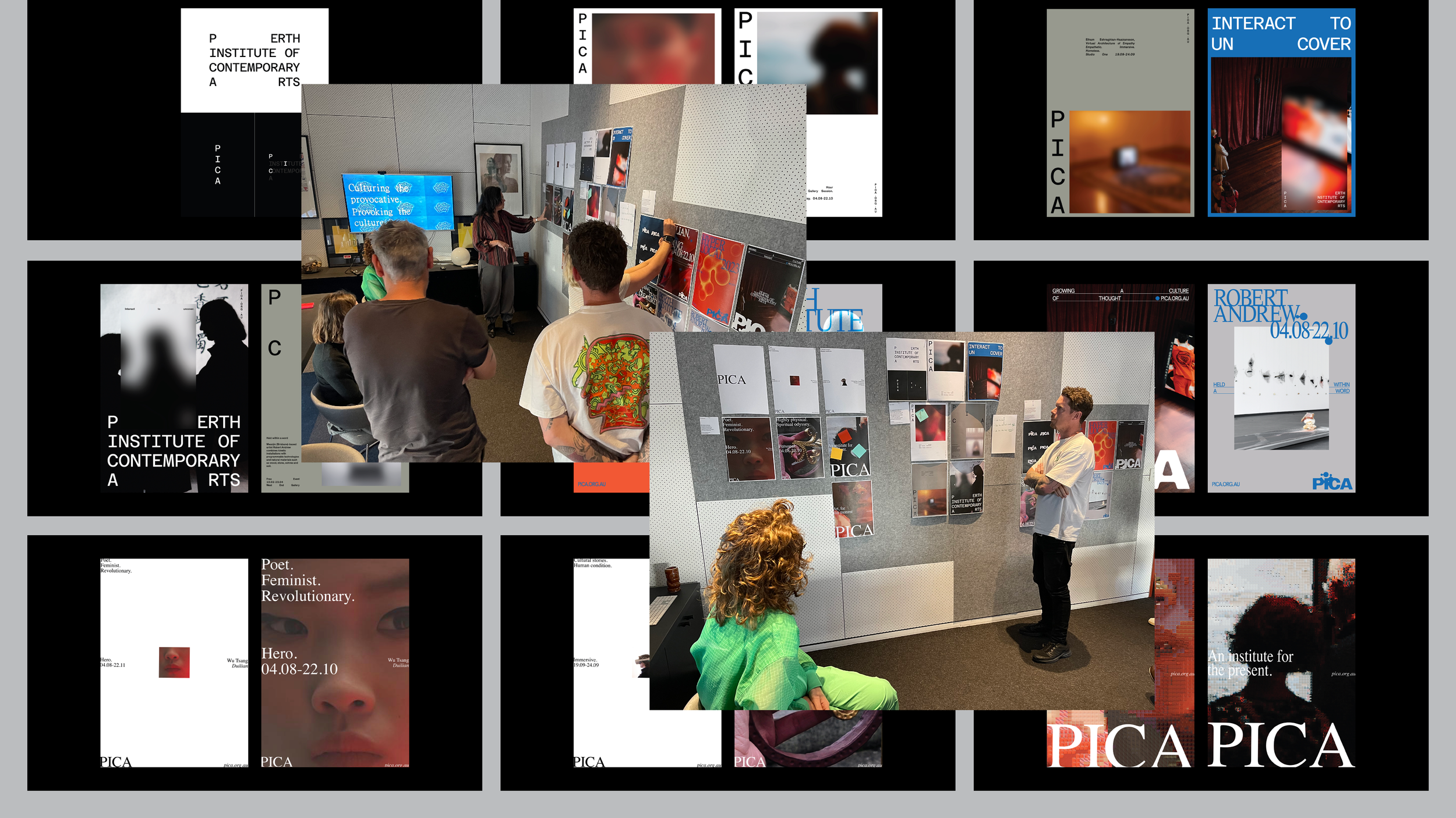
ABOVE: Final PICA brand
development and identity.
(From Telling Babies from
Bathwater: A Rebranding
Field Guide, 2024 Fremantle
Design Week)
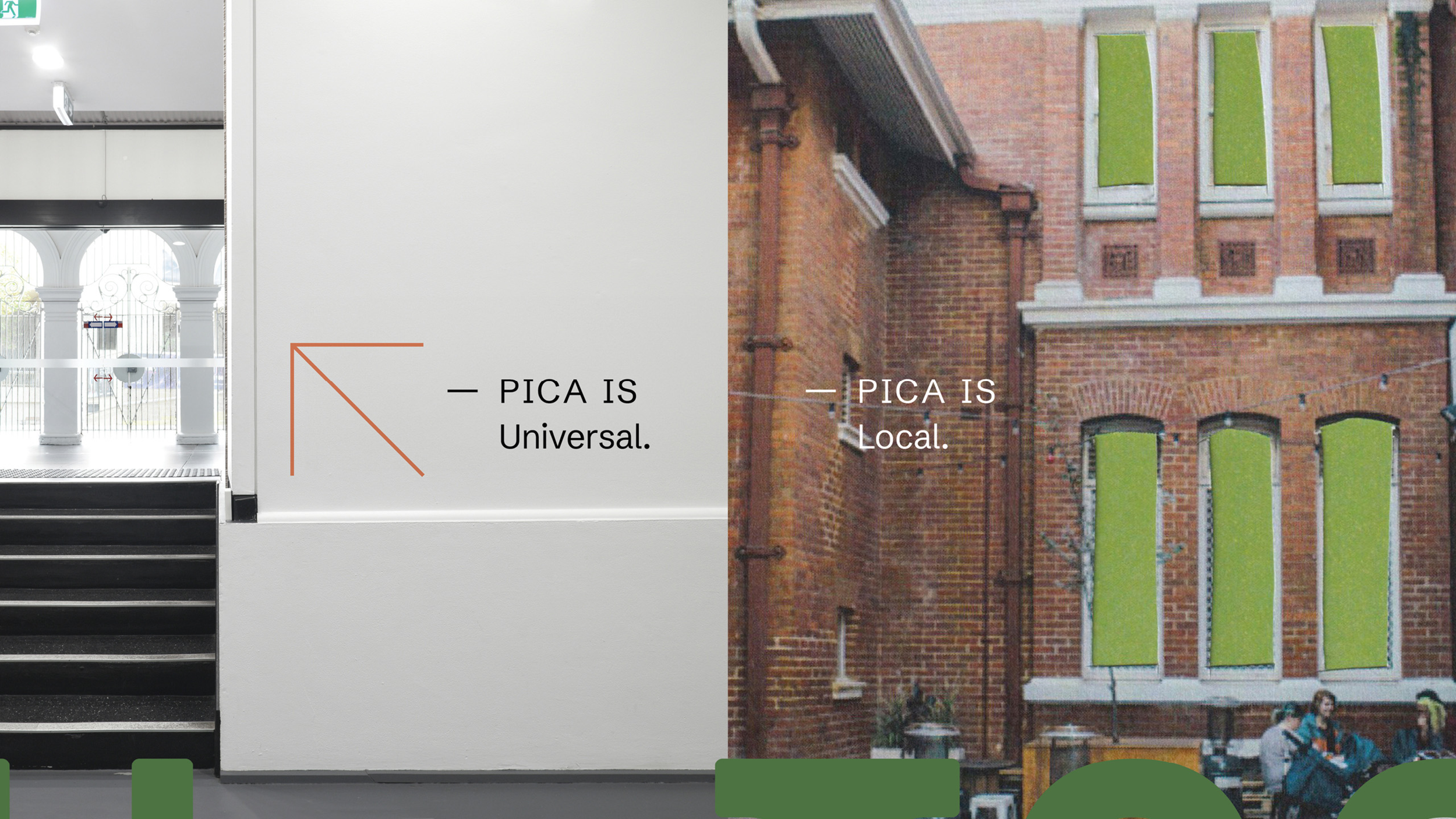
Like the development of the bespoke wordmark, this colour choice was another branding decision inspired by the space. (See also the inclusion of three dots in the corner of every frame: a subtle nod to the three arches, three windows and other recurring examples of the classic ‘rule of threes’ throughout the building.)
“We have a pretty clear process that we follow and this stepped away from that because of the nature of the project,” says Mark. “But it’s ended up where it should be. If we hadn’t had these tensions and difficulties and gone up this dead end, we wouldn’t have ended up where we did.
“It’s not the way you’d necessarily choose to do it, but the result ended up feeling right—but it’s that right kind of wrong.”